Visualizing Strava Data: Lessons from Geospatial Data in Python

This past summer, I started using Strava as a kind of diary to record my walks and runs while on maternity leave. Between nap schedules and coffee runs, I ended up exploring several new coffee shops and walking routes around the neighbourhood.
By the end of summer, I had logged over 30 runs and walks on Strava. It felt like a good excuse to combine them into a single visualization — a way to see my summer at a glance and finally get more comfortable with Python’s geospatial libraries, which had always felt a bit intimidating.
Importing the data
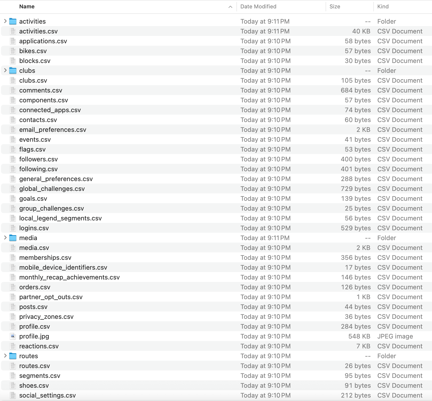
To start, I needed to get my data out of Strava. I requested a full export of my account, and within a few minutes, Strava had emailed me dozens of files — everything from profile metadata to activity logs:
I was mostly interested in my activity logs which were stored in GPX format. GPX, short for GPS Exchange Format, is an XML-based format that stores latitude, longitude, elevation, and timestamps for each recorded point. Here's a snippet from one of my Strava GPX files which also captured heart rate and "power" from my Apple Watch:
<trkpt lat="43.6605380" lon="-79.4676390">
  <ele>112.0</ele>
  <time>2025-08-17T17:26:13Z</time>
  <extensions>
    <power>161</power>
    <gpxtpx:TrackPointExtension>
      <gpxtpx:hr>164</gpxtpx:hr>
    </gpxtpx:TrackPointExtension>
  </extensions>
</trkpt>
A single data point from a Strava run.
Each activity file contains hundreds or even thousands of data points (roughly 10-50K lines of XML), depending on how long I was moving and how frequently my device logged location updates. On my Apple Watch, it seemed to record roughly one data point per second.
Parsing the data
To parse these files, I used the gpxpy library which helped extract coordinates, timestamps, and elevation points into a pandas-friendly format. Here's a (simplified) script that parses my Strava data:
import gpxpy
import pandas as pd
import glob
gpx_files = glob.glob("data/activities/*.gpx")
records = []
for file in gpx_files:
with open(file, "r") as f:
gpx = gpxpy.parse(f)
for track in gpx.tracks:
for segment in track.segments:
for point in segment.points:
records.append({
"activity_file_name": file,
"lat": point.latitude,
"lon": point.longitude,
"elevation": point.elevation,
"time": point.time
})
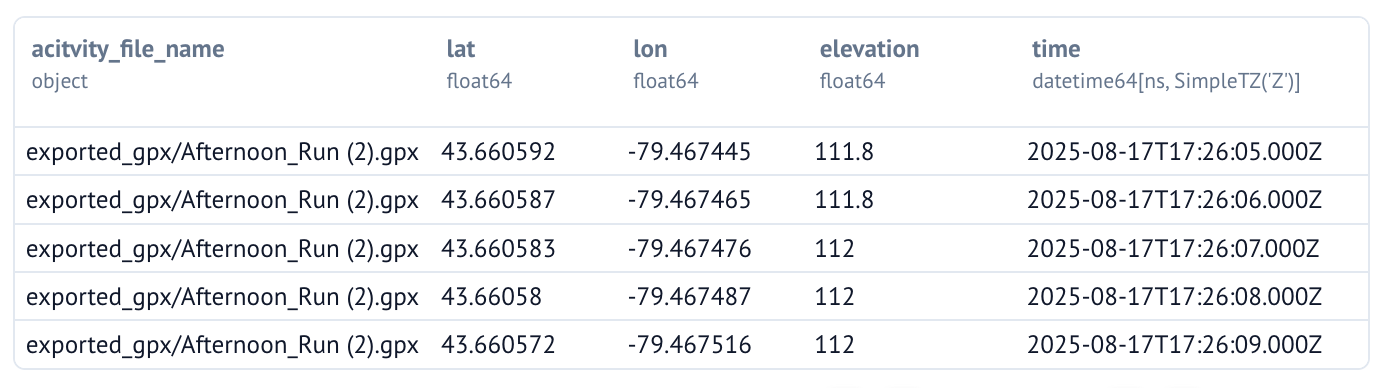
df = pd.DataFrame(records)The output looks like this:
I also added Apple Watch's metrics like heart rate and power to the datafarme whenever they were available. With all of the Strava data stored in a tidy dataframe, we're now ready to proceed to the next step – visualizing it!
Visualizing the data
There are several options for plotting geospatial data in Python:
matplotliborseabornfor static 2D plotsplotlyfor quick interactive scatterplots, or-
cartopyandcontextilywhich are meant specifically for geospatial data
In the end, I chose a Python library called Folium which is Leaflet.js under the hood. It's well-documented, lightweight, and produces beautiful interactive maps.
With Folium, we first need to 1) create a base map and 2) overlay the GPS tracks on top (in the form of a PolyLine). Here's a (simplified) script that visualizes our Strava dataframe on a map:
import folium
# Create base map
m = folium.Map(
location=[df["lat"].median(), df["lon"].median()],
zoom_start=12,
tiles="CartoDB positron"
)
# Add all coordinates as a single PolyLine
coords = df[["lat", "lon"]].dropna().values.tolist()
folium.PolyLine(coords, color="blue", weight=3).add_to(m)
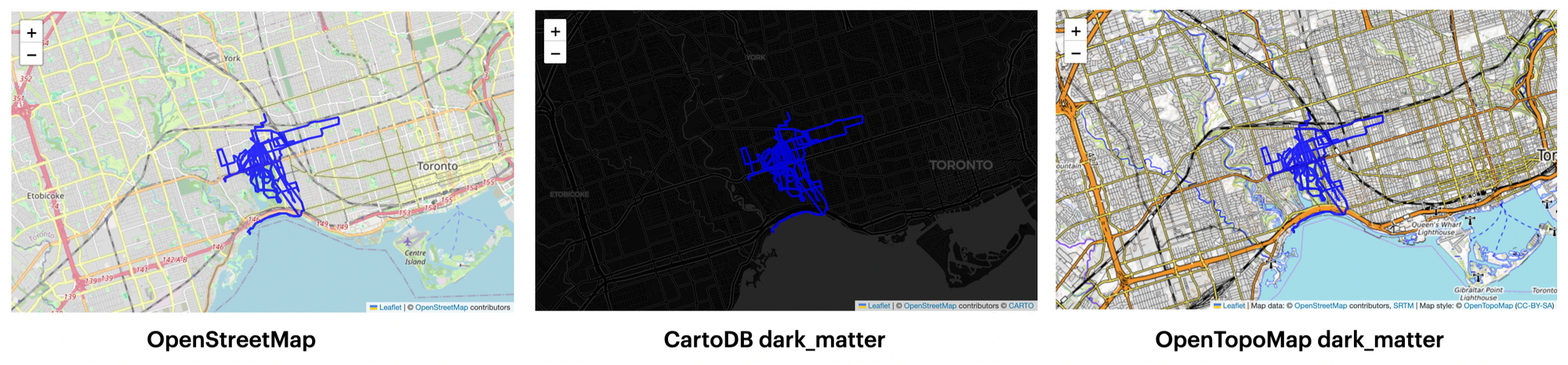
mThis is what the output looks like:
You can interact with Folium's maps directly in your Jupyter/Marimo notebook!
We can also customize the look and feel of the map by tinkering with the tiles argument, which controls the base map style.
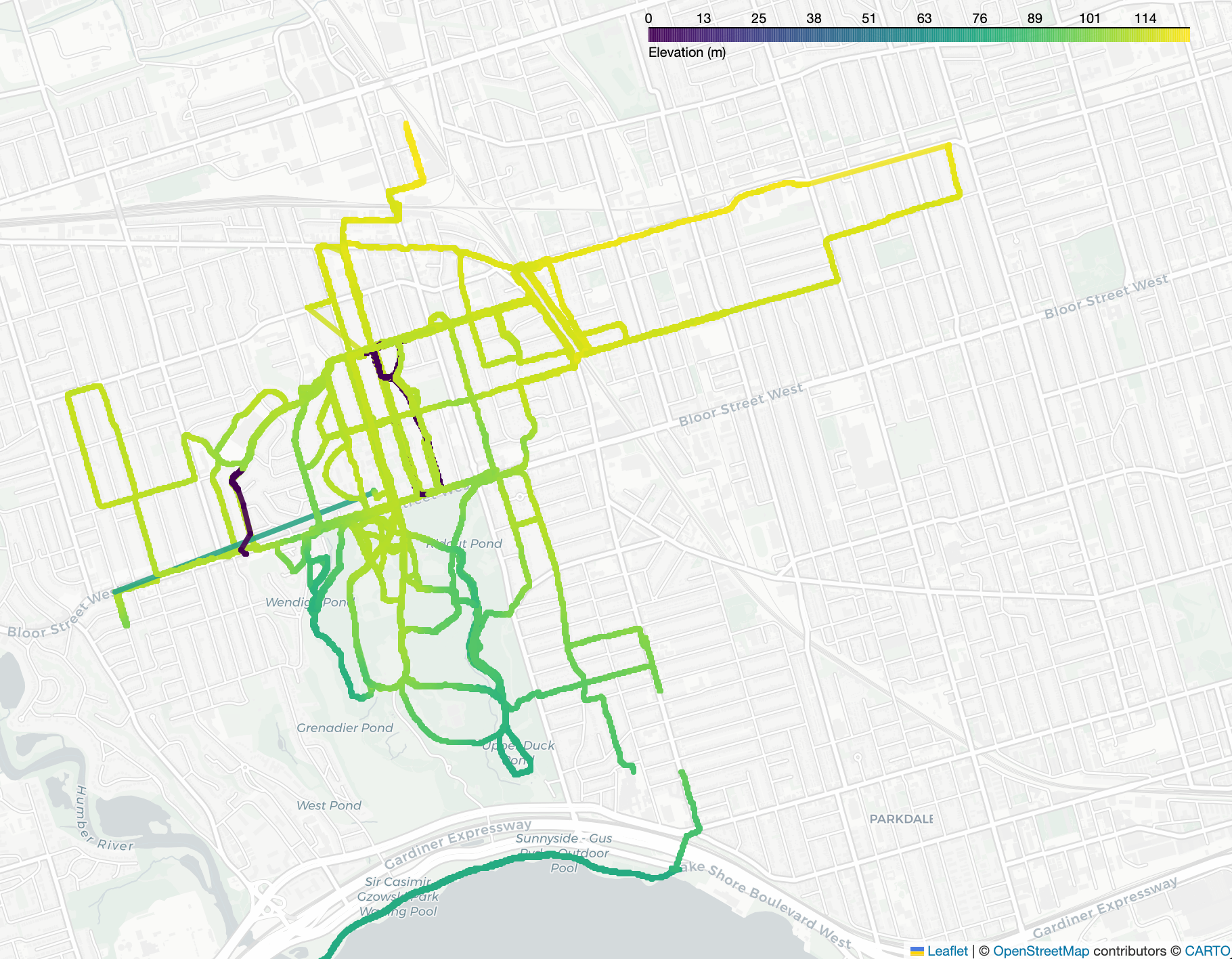
I went even further and experimented with different line colors. I first tried mapping color to elevation, which essentially shows the elevation of Toronto rather than the elevation gains during my runs:
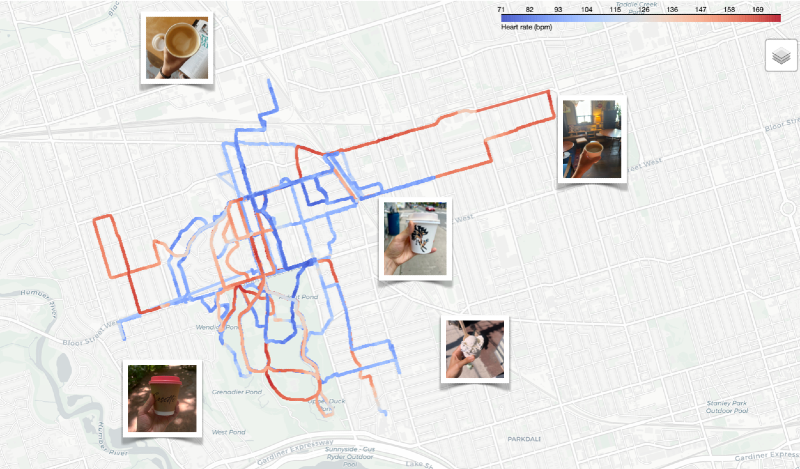
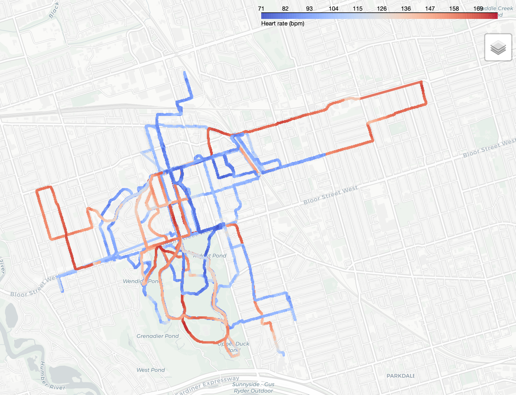
I then tried mapping color to my heart rate, which ended up filtering out some of the Strava activities because I wasn't always wearing my Apple Watch:
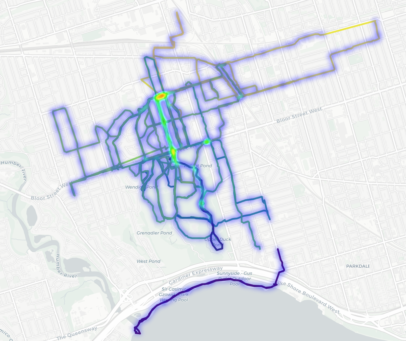
I also experimented with a heatmap to visualize where I ran most but it wasn't super exciting:
Final thoughts
Working with geospatial data turned out to be much more approachable than I expected. Once I got familiar with Strava's GPX format and Folium, it felt like any other data cleaning and visualization problem. As a next step, I could easily build on this by summarizing distances, comparing routes, or automating new uploads to the map. But for now, it’s a clean, finished experiment that turned raw GPX data into something visual and interactive.
If you’ve worked with geospatial data before, I’d love to hear which libraries or tools you’ve used. And if you're on Strava, you can follow me here. Until next time. ✌️