Building a Choropleth Map
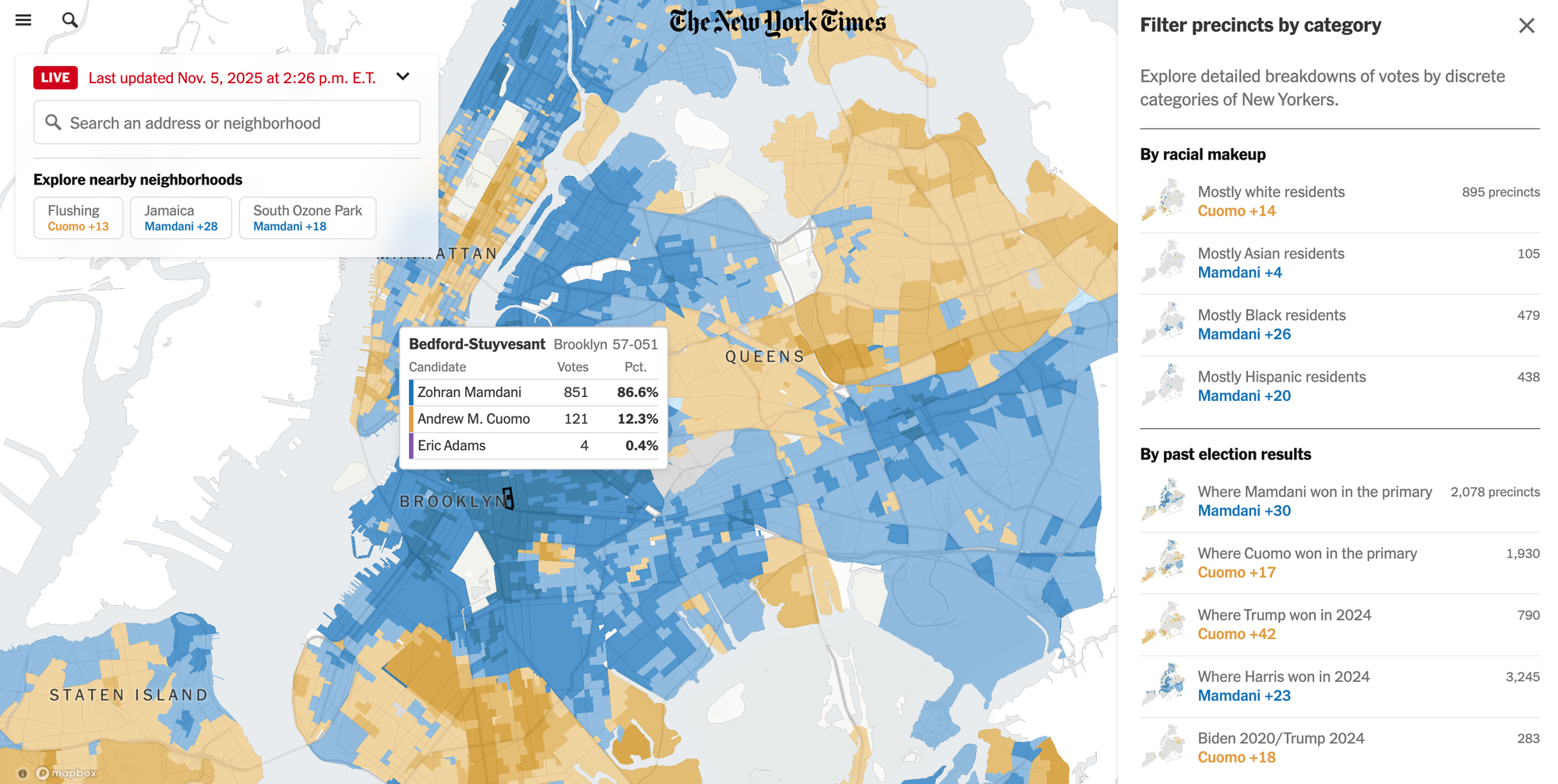
Last week, I followed the 2025 New York City mayoral election and was so impressed by how clearly the New York Times visualized the election results. Their choropleth map did a great job of capturing the city's political mood at a glance. You can see entire boroughs tilt blue (Mamdani) or yellow (Cuomo), and it's easy to inspect results by hovering over specific neighborhoods:
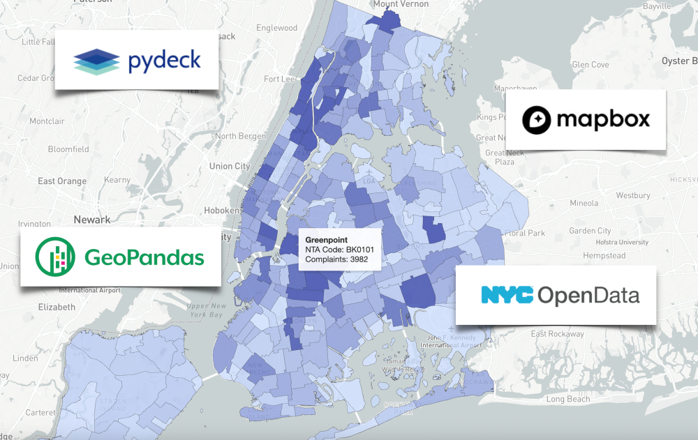
Inspired by the New York Times, I wanted to see if I could build something similar. So, I set a goal for myself to build a choropleth map of NYC using a new dataset. After skimming through NYC's Open Data Portal (highly recommend!), I decided to visualize noise complaints using this 311 dataset — broken down by neighborhood, at the same granularity as the New York Times’ election results map.
First of all – what is a choropleth map??
I honestly didn't know that these colored maps had a name until I looked it up. Here is Wikipedia's formal definition:
A choropleth map is a type of statistical thematic map that uses pseudocolor, meaning color corresponding with an aggregate summary of a geographic characteristic within spatial enumeration units, such as population density or per-capita income.
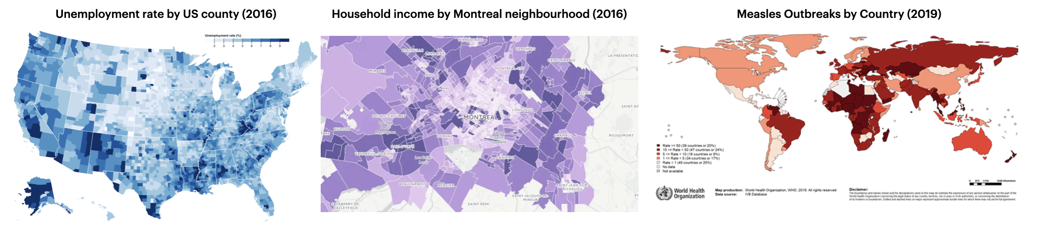
From election results to air quality reports, choropleth maps are used to understand how data changes across space. By shading each region based on a value (e.g., income, population, or voter turnout), they make it easier to see patterns in complex datasets.
From a technical perspective, a choropleth map is composed of colored polygons, which represent spatial variations of a numeric variable. It combines three things:
- Geographic boundaries: the shapes that define areas like countries, provinces, or neighborhoods (often stored in geojson or shapefile format).
- Data values: the numbers you want to visualize, such as population, income, or voter turnout.
- A color scale: which maps those values to colors, helping patterns stand out visually.
The result is a visual summary of how something changes across space.
Choosing the right tools
When I started researching how to build choropleth maps, I quickly realized there are a lot of geospatial tools out there – in R, Python, JavaScript, and even SQL (!).
After some digging, I learned that the New York Times uses Mapbox under the hood so I knew I wanted to do something similar. Luckily, Python offers a couple of libraries that integrate Mapbox's API: Plotly* and PyDeck.
*Note: Plotly’s Mapbox integration is being deprecated in favor of MapLibre. So for this project, I’ll focus on PyDeck instead.
Defining the neighborhood boundaries
There are over 200 neighborhoods across New York City's 5 boroughs and we need to define the boundaries of each one. Thankfully, the NYC Open Data Portal provides a geojson file that does exactly that. The file contains an array of "features", where each feature represents a single neighborhood. Each feature includes:
- a list of latitude/longitude pairs (~500 per neighborhood) that define the polygon boundary, and
- a set of properties with metadata such as the neighborhood’s name, borough name, shape area and boundary length
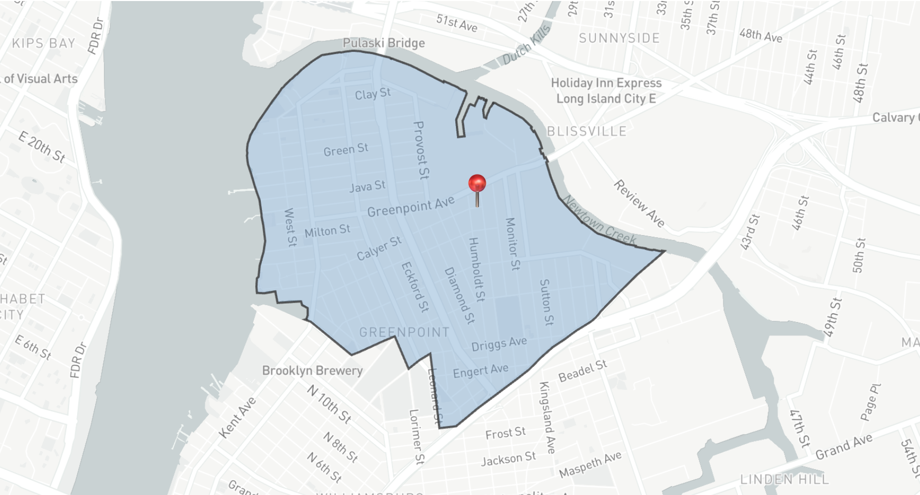
Here’s a simplified example of what one neighborhood (Greenpoint) looks like in the geojson file:
{
  "features": [
    "coordinates": [
      [-73.9321354009414, 40.728167865433],
      [-73.9323831882073, 40.7279992888619],
      [-73.932508048572, 40.7279166037536],
      [-73.9341247992401, 40.7268637331533],
      // .... (hundreds of coordinates!!)
    ],
    "properties": {
      "OBJECTID" : 1,
      "BoroCode" : 3,
      "BoroName" : "Brooklyn",
      "CountyFIPS" : "047",
      "NTA2020" : "BK0101",
      "NTAName" : "Greenpoint",
      "NTAAbbrev" : "Grnpt",
      "NTAType" : "0",
      "CDTA2020" : "BK01",
      "CDTAName" : "BK01 Williamsburg-Greenpoint (CD 1 Equivalent)",
      "Shape__Area" : 35321809.118660927,
      "Shape__Length" : 28919.560816111341
    }
  ]
}
Very simplified version of a neighborhood defined in the geojson file.
We’ll use this geojson file to map each 311 noise complaint to its corresponding NYC neighborhood, which will allow us to visualize the number of complaints across the city.
Mapping coordinates to NYC neighborhoods with GeoPandas
The 311 complaint data includes the latitude and longitude coordinates for every noise complaint in NYC, but it doesn't tell us which neighborhood the complaint occurred.
To figure out which neighborhood each complaint belongs to, we need to join the 311 dataset with the geojson boundaries. This type of operation is called a spatial join. Instead of matching rows by a common key like an ID, we match them based on location.
In this case, each noise complaint is represented as a point on a map, and each neighborhood in the geojson file is represented as a polygon. The spatial join checks which polygon each point falls inside and assigns that neighborhood’s name to the complaint.
We can do this easily with a package called GeoPandas, a library built on top of Pandas that adds support for geospatial data. After converting the 311 complaint data to a GeoDataframe, we can apply the sjoin() (spatial join) method with the geojson file to match each point to the neighborhood polygon it falls within:
import pandas as pd
import geopandas as gpd

# load boundaries file
neighborhood_boundaries = gpd.read_file("nta_2020.geojson")

# creating the 311 complaints geopandas dataframe
df = pd.read_csv("311_complaints.csv")
complaints = gpd.GeoDataFrame(
    df,
    geometry=gpd.points_from_xy(df.longitude, df.latitude),
    crs="EPSG:4326"
)

# spatial join to identify the neighborhood for each shooting
complaints_neighborhoods = gpd.sjoin(
  complaints,
  neighborhood_boundaries,
  how="inner",
  predicate="intersects"
)
Once that’s done, every 311 complaint will have a neighborhood attached to it:
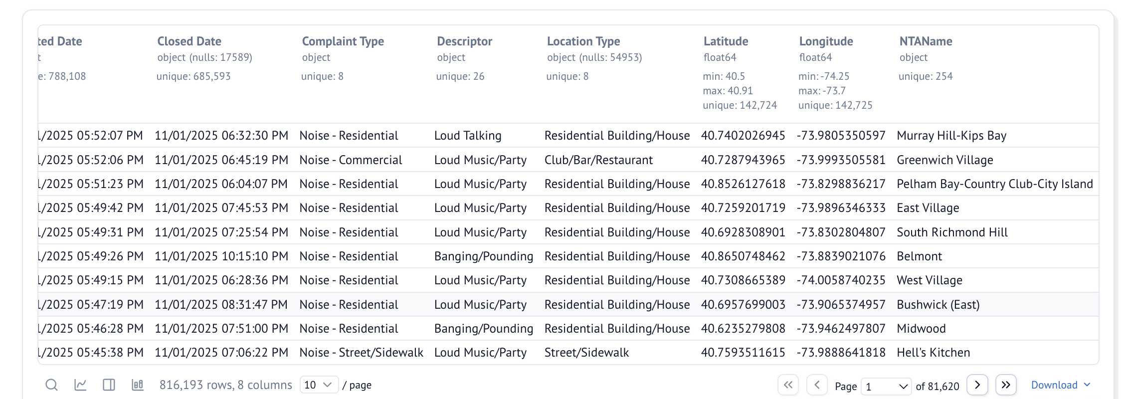
We can now aggregate the data by neighborhood and start visualizing which areas of New York have the most noise complaints:
complaints_neighborhoods.groupby('NTAName').size()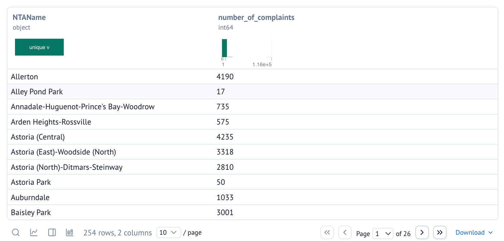
This is all the data we need to create our choropleth map. Next, we need to set up the Mapbox API!
Setting up Mapbox
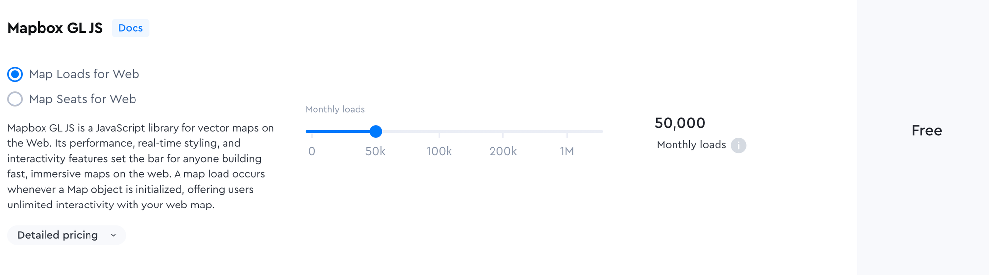
In order to use the Mapbox API, we first need a Mapbox account. The first 50K monthly map loads are free, which should be more than enough for a side project!
The cool thing about Mapbox is that you can customize your own map style by changing the fonts, the presence/absence of labels, and even the greenspace and water color palette. You can also tweak the "light preset" (day, dawn, dusk, or night) to match the mood of your visualization.
Each style you create in Mapbox has its own URL, which you can plug into your Mapbox API call to render the map using your custom design.
Now that we have a Mapbox API token, let’s put it all together and render our choropleth map in PyDeck.
Creating the choropleth map with PyDeck
PyDeck is fast, powerful, and built on deck.gl, which lets you render complex polygons and extremely large datasets. The trade-off is that it has a steeper learning curve than typical Python plotting libraries and it's a bit verbose. But once you get the hang of it (or use AI agents too!), PyDeck is pretty great.
PyDeck works by defining one or more layers (polygons, points, heatmaps, etc.) that describe what gets drawn, and then wrap them in a "deck" object, which controls the view state, interactivity (i.e., tooltip), and base map styling. Here’s a simplified version of what that looks like:
layer = pdk.Layer(
    "GeoJsonLayer",
    geojson,
    id="neighborhood-layer",
    pickable=True,
    stroked=True,
    filled=True,
    wireframe=False,
    get_fill_color="[200 - properties.normalized * 180, 220 - properties.normalized * 180, 255 - properties.normalized * 100, 180]",
    get_line_color=[51, 51, 51, 255],
    line_width_min_pixels=0.3,
)

view_state = pdk.ViewState(
    latitude=40.7128,
    longitude=-74.0060,
    zoom=9.3,
    pitch=0,
    bearing=0
)

deck = pdk.Deck(
    layers=[layer],
    initial_view_state=view_state,
    map_provider="mapbox",
    map_style="mapbox://styles/mapbox/light-v10",
    api_keys={"mapbox": MAPBOX_TOKEN},
    tooltip=tooltip
)
deck.to_html("nyc_noise_complaints.html")
And here's the finished product!
NYC noise complaints by neighborhood, from Nov 1st 2024 to Nov 1st 2025.
Building this map taught me far more about geospatial data than I expected. I went in thinking it would be a quick visualization project, but I ended up learning about spatial joins, neighborhood boundaries, Mapbox styling, and the quirks of working with real-world geographic data. I also got comfortable with 3 new tools along the way: GeoPandas, PyDeck, and Mapbox. 😄
This wasn’t the easiest project but that’s also why I enjoyed it. Working with unfamiliar tools forced me to slow down, read docs (yes, I still read docs despite using Cursor!), and spend time tinkering until things finally clicked.
If you’re looking to get out of your comfort zone, I highly recommend trying a hands-on project like this. You'll learn a ton, and seeing the final map feels so satisfying. I’m excited to build more choropleth maps in the future!!